Communicating a world wide footprint in a meaningful way.
Providing an immersive experience through art
was important for ATCO and their prominent
entrance feature.
The Opportunity
The ATCO team wanted to visually communicate their world-wide corporate footprint in a meaningful and inspiring way. Heavy was brought on board by ATCO to execute their bold vision by putting our unique PLAN—BUILD™ process to work.
The Approach
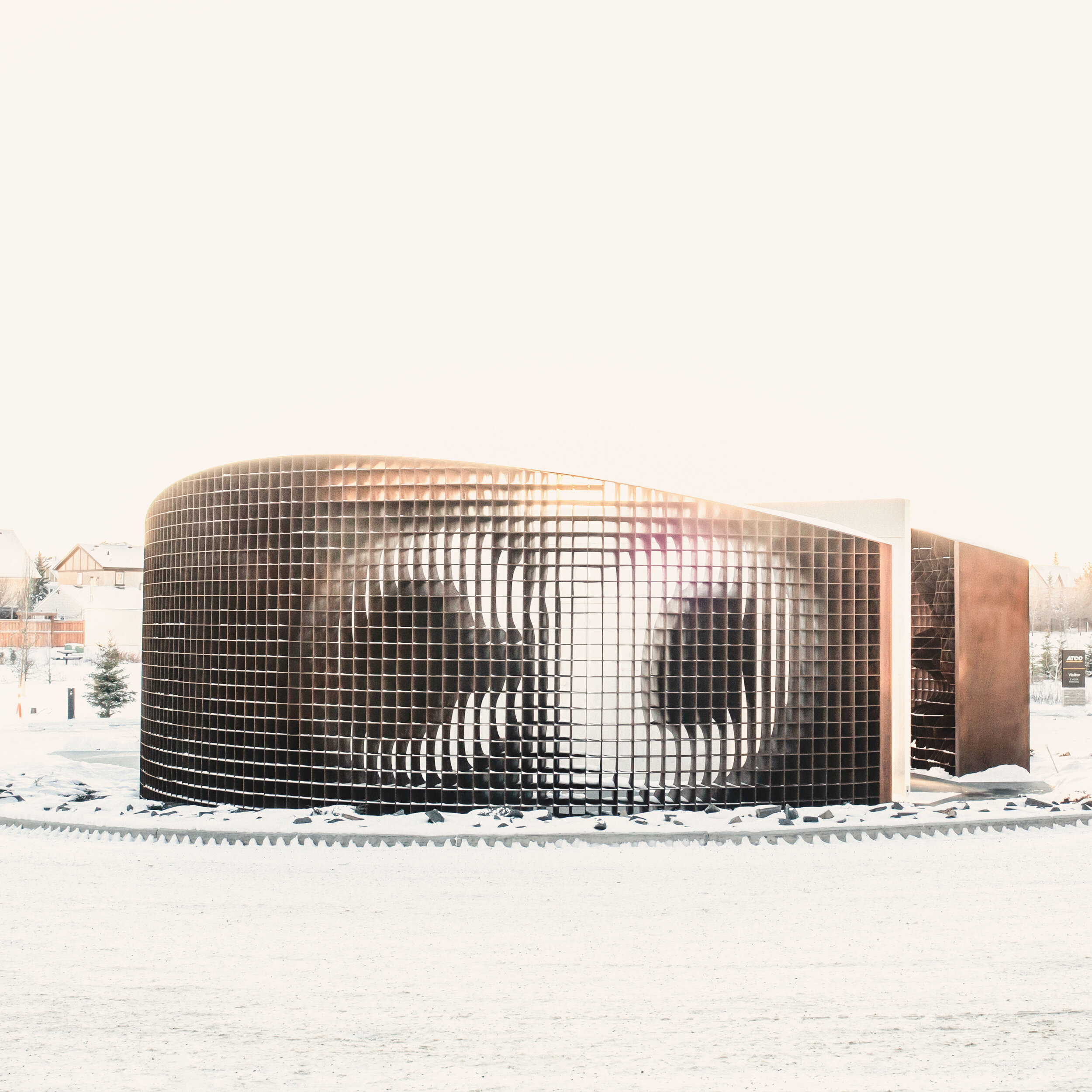
Providing an immersive experience through art was important for ATCO and their prominent entrance feature. Viewers are invited to move around the piece to discover elements that speak to ATCO’s history as a Canadian family legacy.
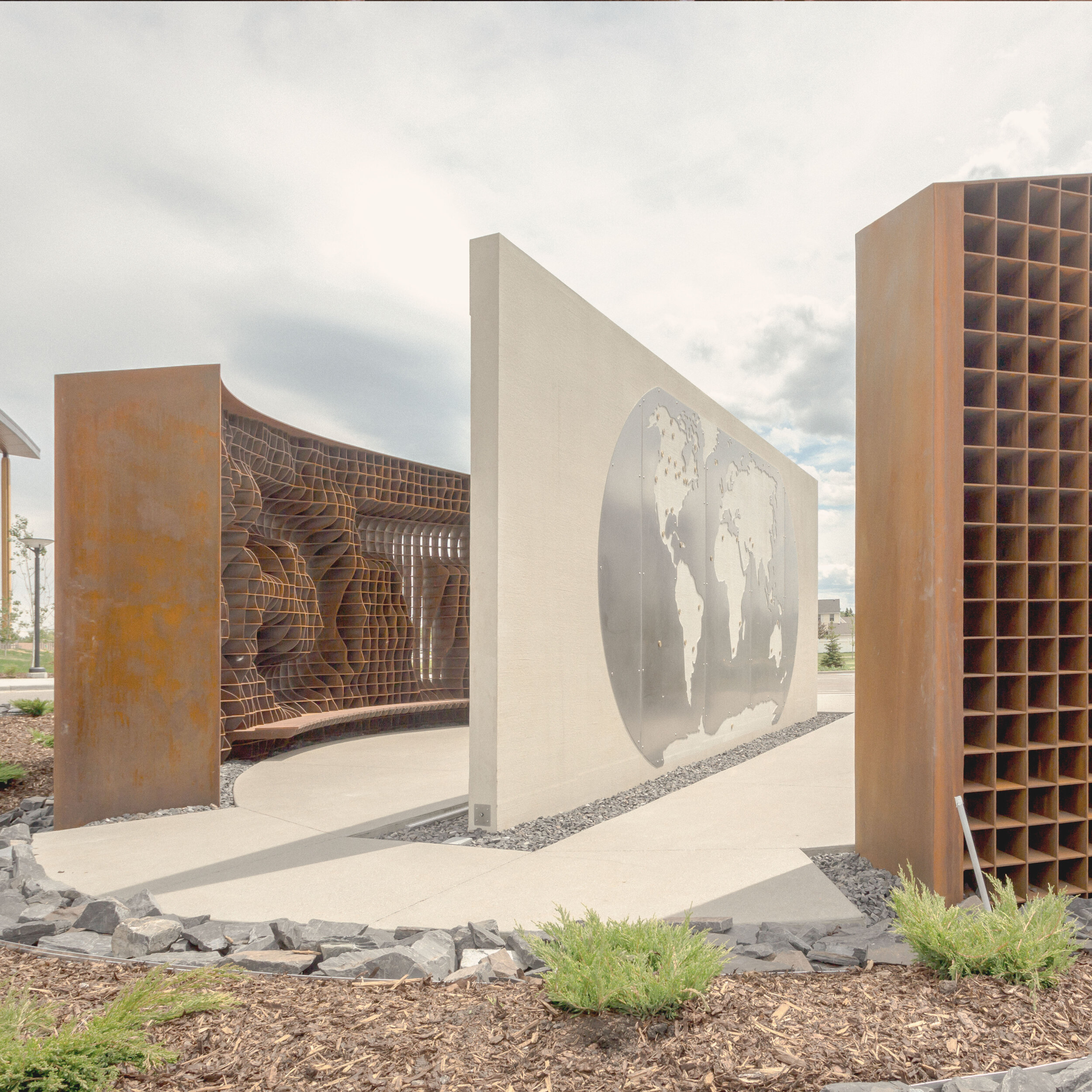
The ATCO Icon communicates pride in Alberta and embraces viewers with a captivating experience by encouraging exploration through story telling.
The basis for the first round of concepts was a globe with each office location around the world signified. Heavy Industries used this concept as a starting point and brought on the team from Studio North, a Calgary-based architectural firm, to further develop the concepts. They collaborated on both the concept development and production of the piece. ⠀
| ATCO ICON |
|---|
| DESIGNER — Studio North |
| CLIENT — ATCO & CANA Construction |
| PROJECT TYPE — Public Art |
| LOCATION — Calgary, AB, Canada |
| MATERIALS — Weathering steel, concrete, lighting, wood, stainless steel |
| SCOPE — PLAN—BUILD™ |
02.17.19—900 — 51.007, -114.120
02.17.19—930 — 51.007, -114.120
06.10.19—1300 — 51.007, -114.120
06.10.19—2120 — 51.007, -114.120

Check out some more work from the ATCO Icon artist at studionorth.ca.
More highlights from our portfolio


