Shepard Station entry feature provides defining landmark welcome
Combining materials in a modern take on entry signage, the Shepard Station gateway feature provides a distinct greeting to all who enter the brand new, state-of-the-art development.
Our Approach
Heavy was approached by the project partners to help execute an eye catching entry feature to the brand new Shepard Station development. Having previously worked closely with both CANA and Bond Creative on several iconic Canadian placemaking landmarks, the project partners knew they could rely on our talented team to ensure this project was brought to life on-time and on-budget while exceeding expectations.
The Opportunity
Conceptualized by Bond Creative, our project development team worked closely with the architect and GC to ensure feasibility be achieved without watering down the original design intent.
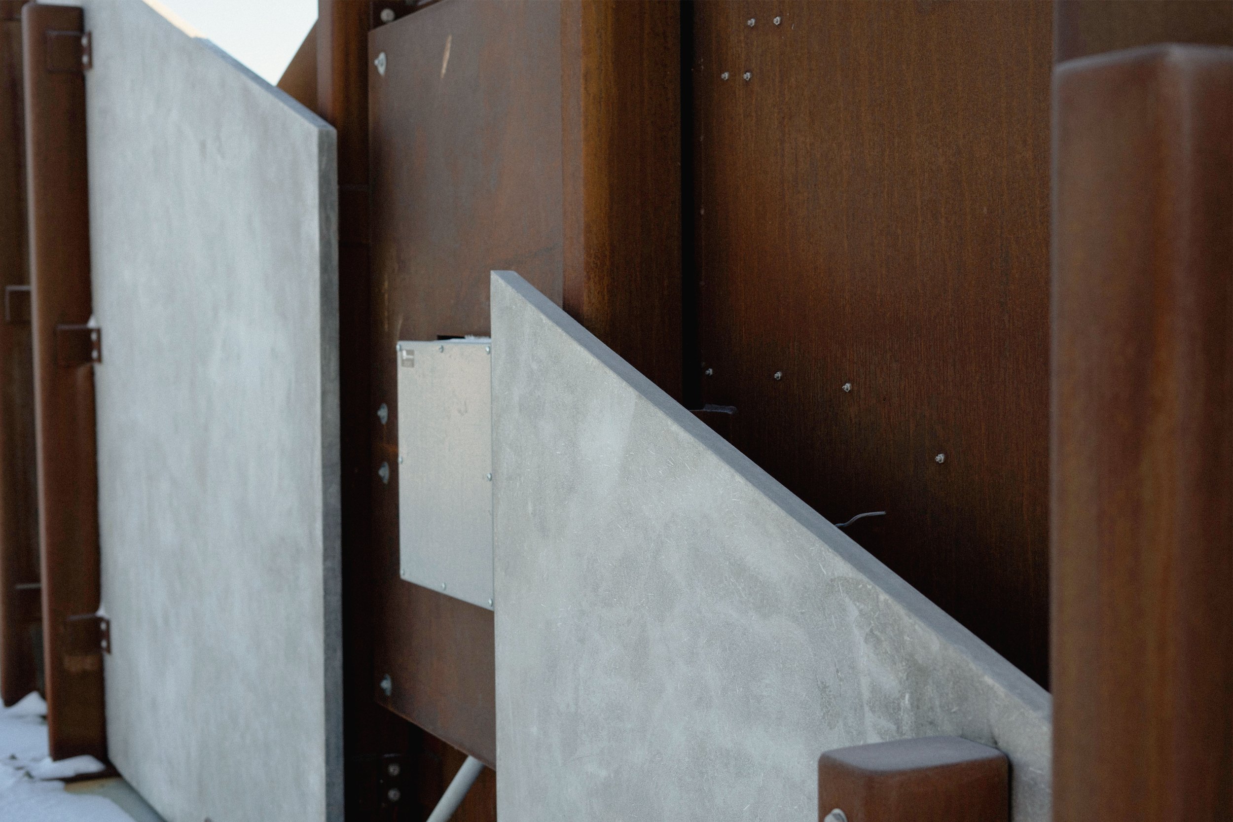
The feature combines Cloudcrete, stainless steel and weathering steel. The result is an effective modern approach, invoking industrialism, yet warmth. This identifying gateway defines one of South Calgary’s newest business park additions.
The brushed stainless steel lettering is backlit for an effective contrast at night. During the day, the stark juxtaposition of intentionally rusted weathering steel with the pristine letters serves as a compliment to the angular paneling.
| Shepard Station Entry Feature |
|---|
| DESIGNER — Bond Creative |
| CLIENT — CANA Construction |
| PLACE — Calgary, AB, Canada | MATERIALS — Cloudcrete, weathering steel, stainless steel |
| SCOPE — PLAN—BUILD™ |
12.16.21—1005 — 50.933, -113.972
12.16.21—1015 — 50.933, -113.972
12.16.21—945 — 50.933, -113.972
12.16.21—940 — 50.933, -113.972
12.16.21—1000 — 50.933, -113.972

For more information about Shepard Station Sign designers, check out bondcreative.com.
More highlights from our portfolio


